




Space Tech

The Exploration Company

Project Details

With advancements in reusable rockets and in-orbit refueling, space is no longer the exclusive domain of governments or billionaires. The global space transportation market is poised to expand from $5 billion to $50 billion over the next decade, with new space stations being built in Earth's orbit and around the Moon. However, space exploration has historically been exclusive, and often divisive, with access reserved for a select few. The Exploration Company aims to change that.

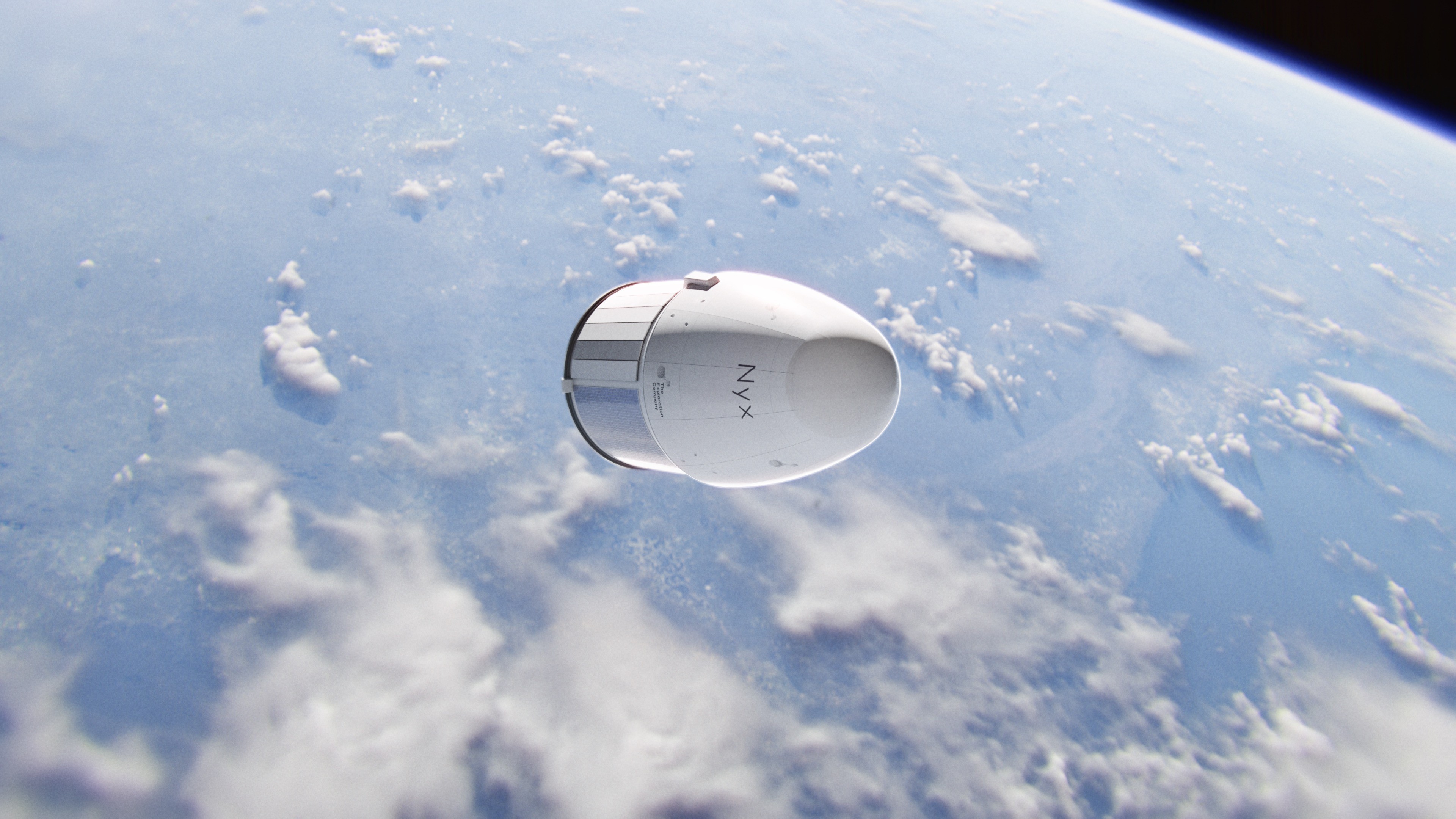
Founded in 2021, The Exploration Company is led by Airbus alumna Hélène Huby and a team of space engineers formerly behind some of Europe’s most complex programs, including Orion-ESM, Ariane, and ATV. The Exploration Company’s mission is rooted in sustainability, accessibility, and international cooperation—a stark contrast to the exclusive, elitist approach often associated with space ventures. Their flagship vehicle, Nyx, is a reusable and in-orbit refillable spacecraft designed to transport cargo and humans. It is capable of delivering payloads safely to and from any space station—whether around the Earth or the Moon. With a focus on transparency and peaceful collaboration, The Exploration Company is leading the charge to democratize space and make it accessible to all.

Omoi was brought in to refresh the brand identity and develop the strategy, design, and content for their Series B investor materials. In addition to the brand refresh and pitch deck, we crafted a wealth of new visual content, including custom 3D renders, photography, and an inspirational brand film. We also relaunched their website and developed recruitment collateral to help attract talent to the rapidly growing team.

In approaching the project, we recognized that The Exploration Company’s vision was distinct from the rest of the space tech industry. The existing landscape of space companies was dominated by cold, sterile, and ultra-futuristic aesthetics that often felt impersonal and detached from the human spirit. We knew that The Exploration Company, with its mission to make space exploration inclusive and cooperative, required a radically different visual and brand approach—one that felt human, warm, and full of optimism.

To guide our creative direction, we drew inspiration from unexpected places—beginning with Fondation Maeght, a cultural space in France that embodies organic beauty, natural light, and warmth. This space, filled with the work of European artists like Miró and Giacometti, became a metaphor for how we wanted to depict space exploration as something deeply human and artistic, rather than cold and mechanical. Another key influence was the Tokyo 1966 World Fair, which represented a time of surreal, larger-than-life structures and bold visions for the future—when optimism around technological advancements was at its peak. We also drew from early space age imagery, especially the way the world marveled at the Apollo missions, and the sense of wonder those moments inspired. Our goal was to combine this retro-futuristic optimism with a modern, approachable aesthetic that humanized the technology behind space exploration.

Further references came from companies that have succeeded in humanizing new technology—brands like Apple, IBM, and Olivetti. We were particularly inspired by Apple’s late-1970s and early-1980s campaigns, which made personal computers feel like an extension of the human hand, incorporating approachable visuals that softened intimidating technology. In particular, we studied the work of legendary designer Paul Rand during his tenure at IBM, and his approach to making complex technology feel familiar, tangible, and even playful.

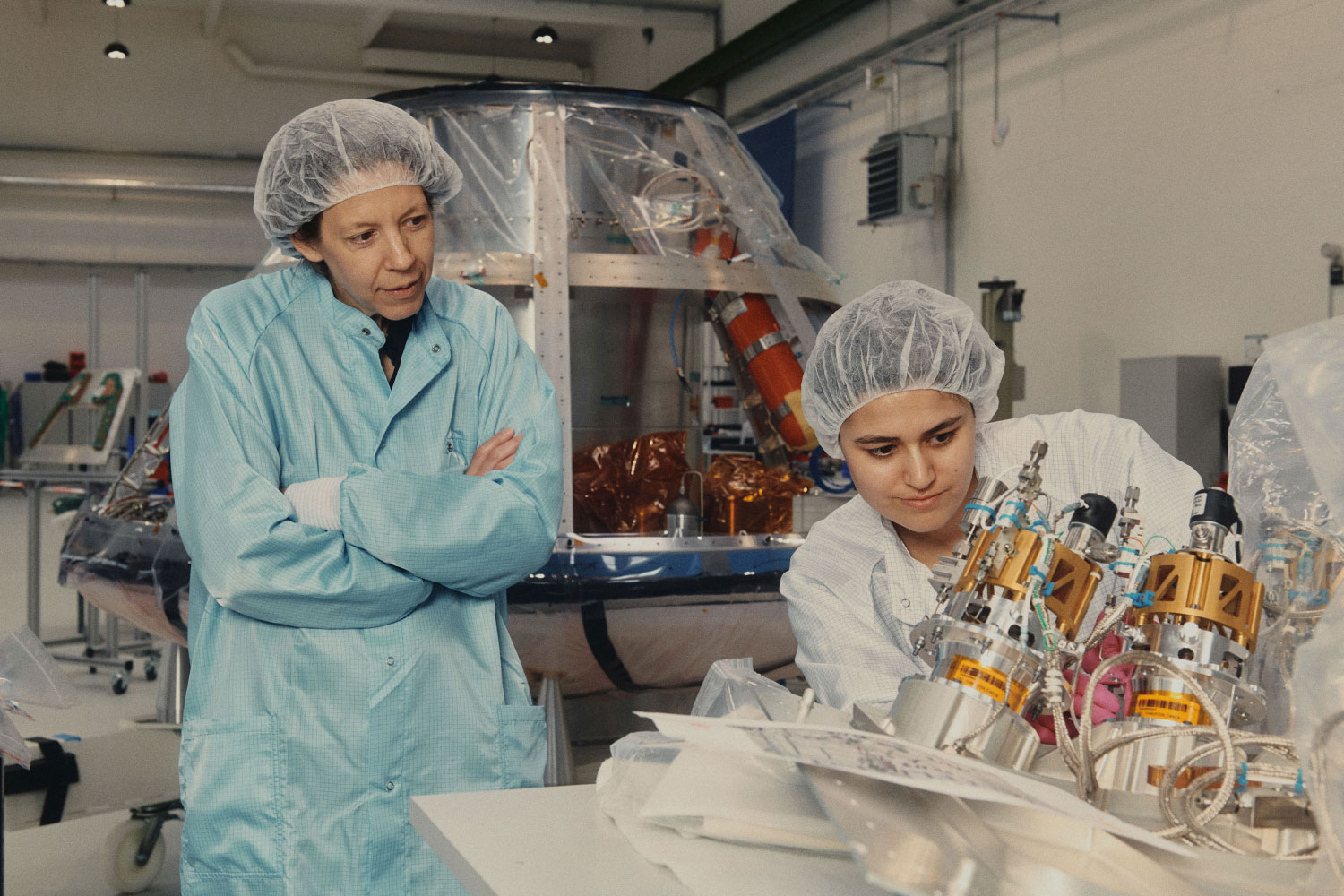
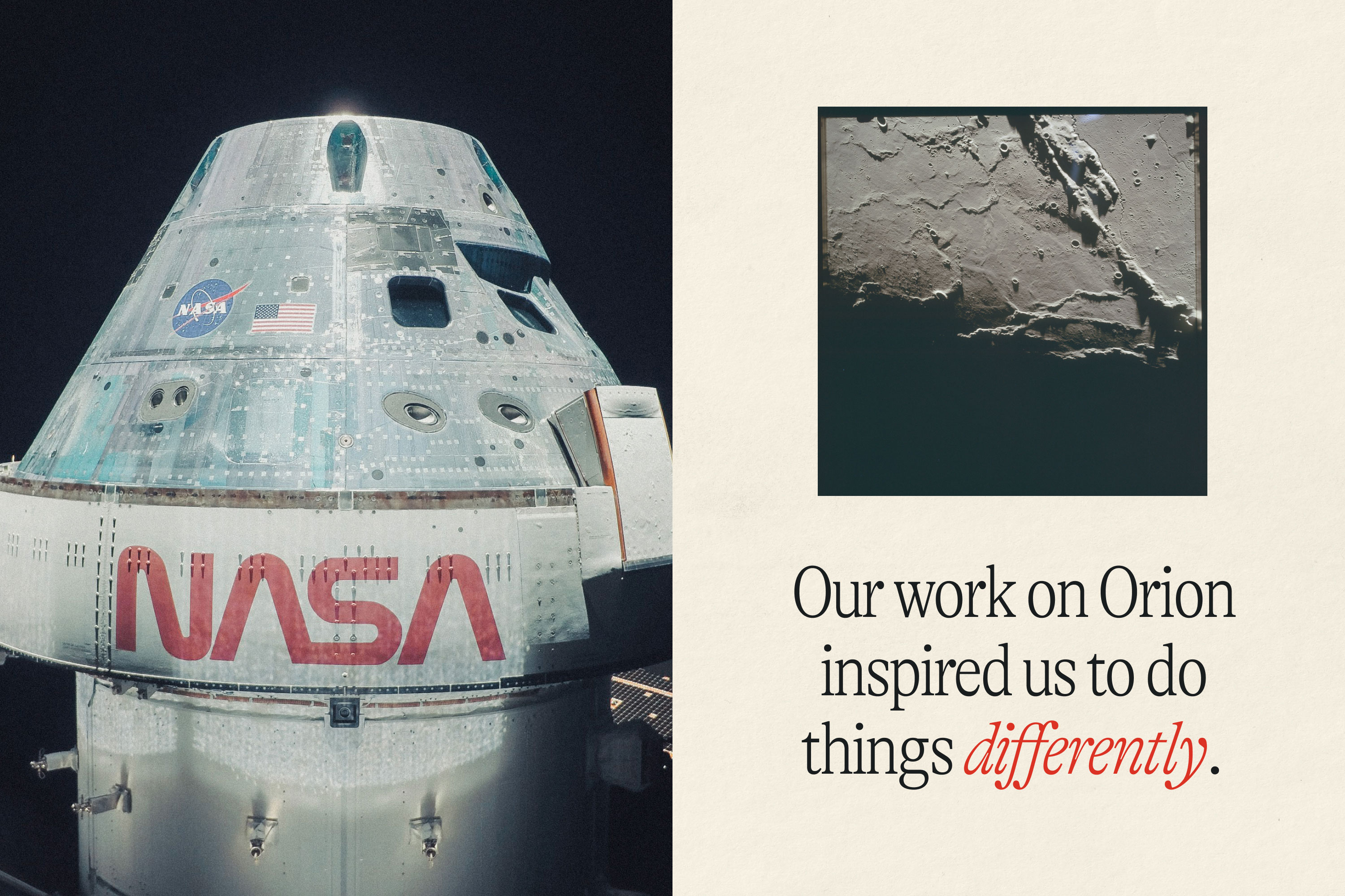
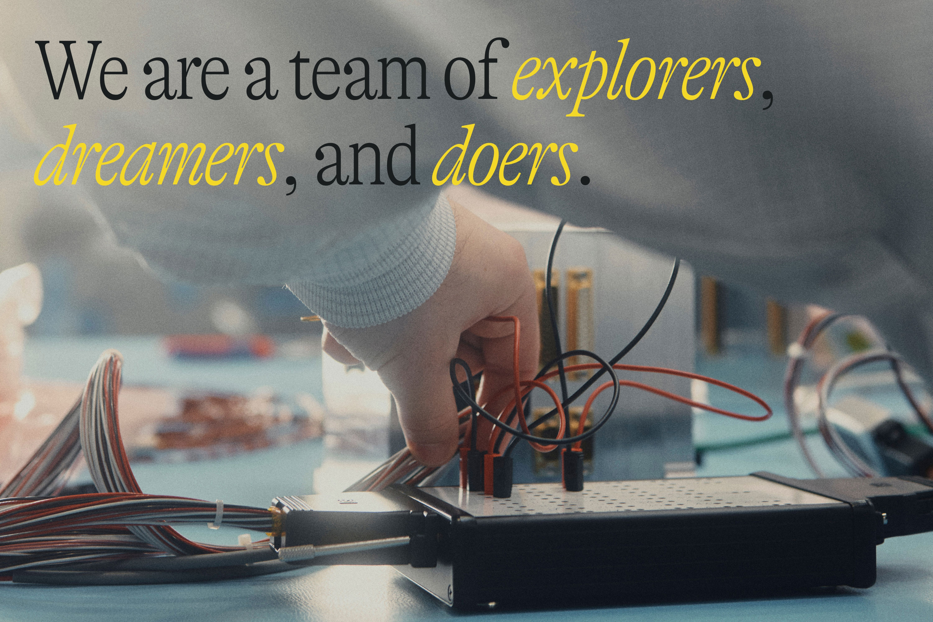
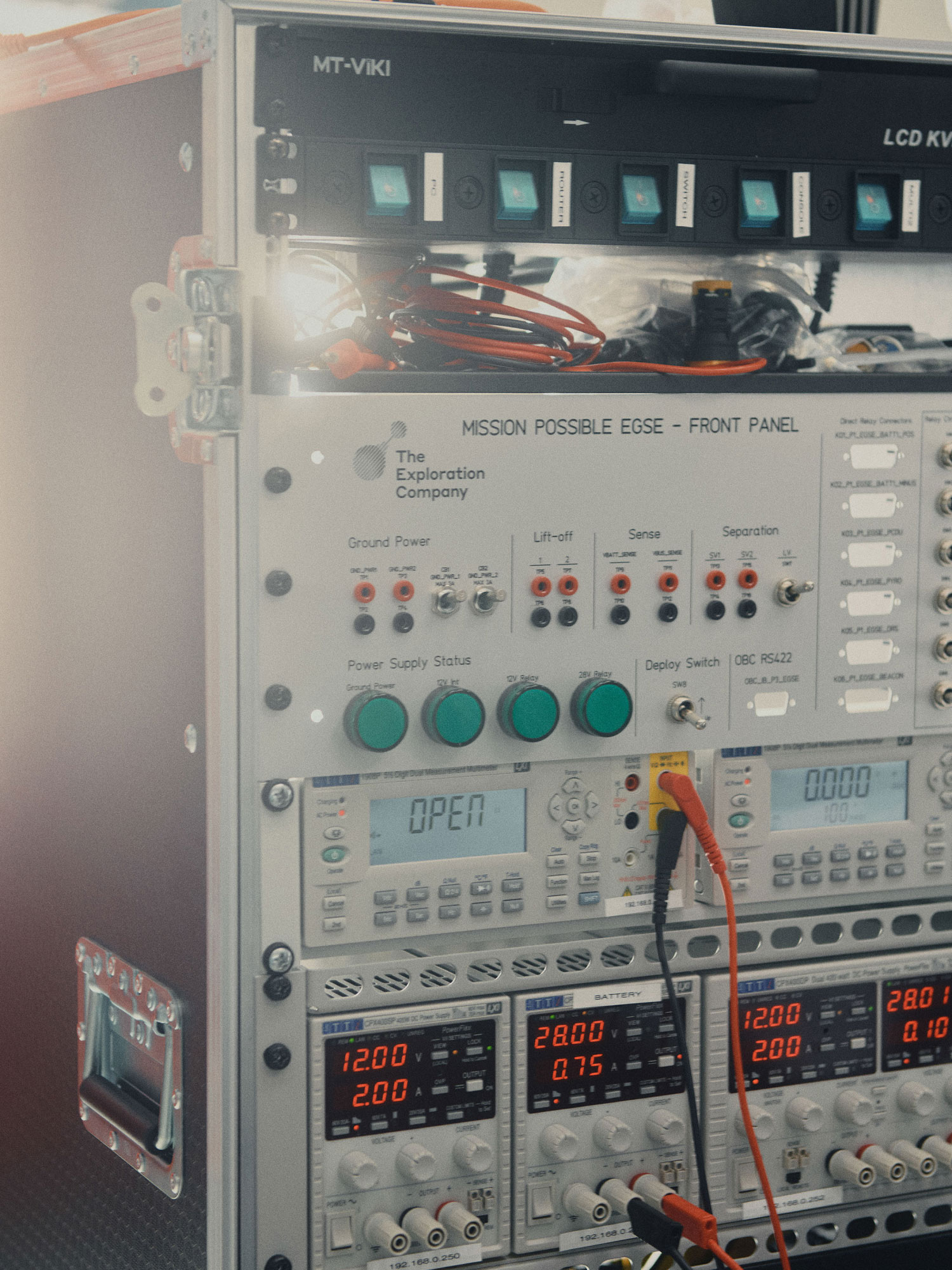
Armed with these references, we built a creative strategy that focused on making The Exploration Company’s brand feel warm, approachable, and optimistic, yet rooted in their groundbreaking work in space technology. Our art direction for their new imagery followed suit: we gave the space capsules a cinematic, almost nostalgic feel, reminiscent of footage captured during the Apollo missions through the use of warm tones, film grain, and light flares.

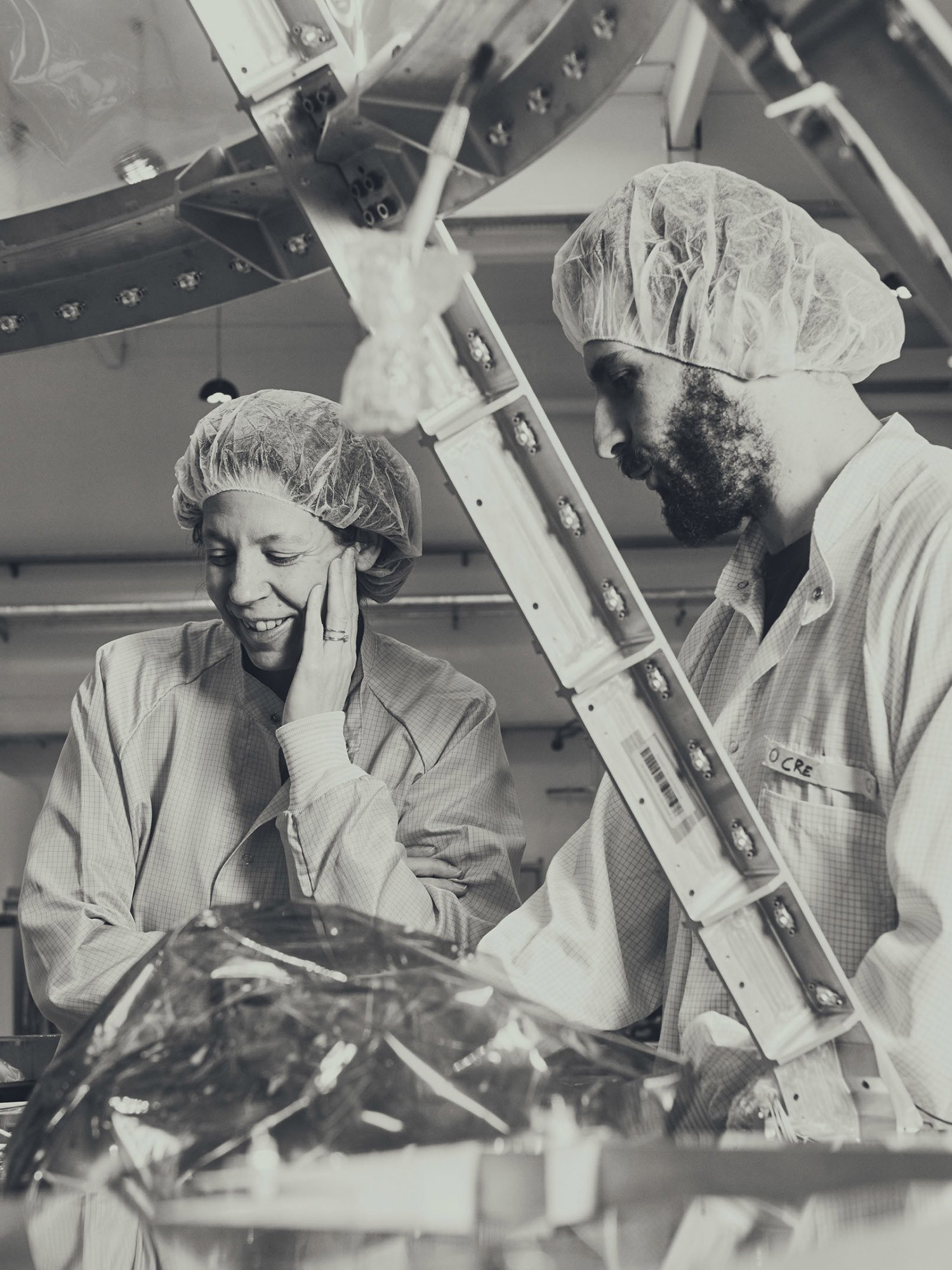
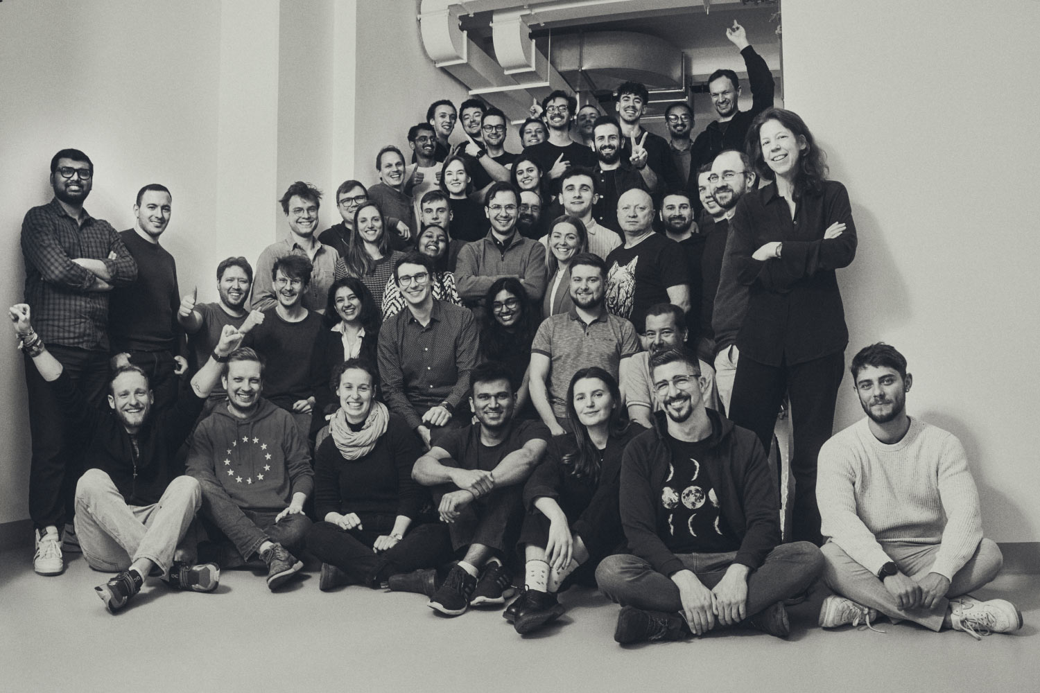
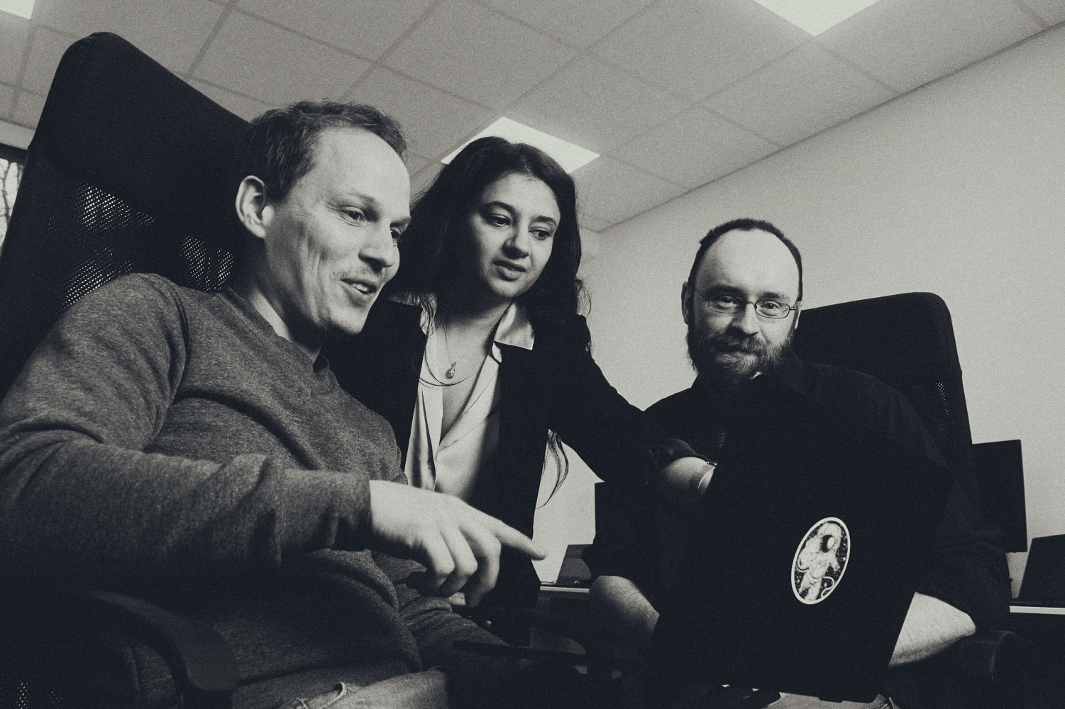
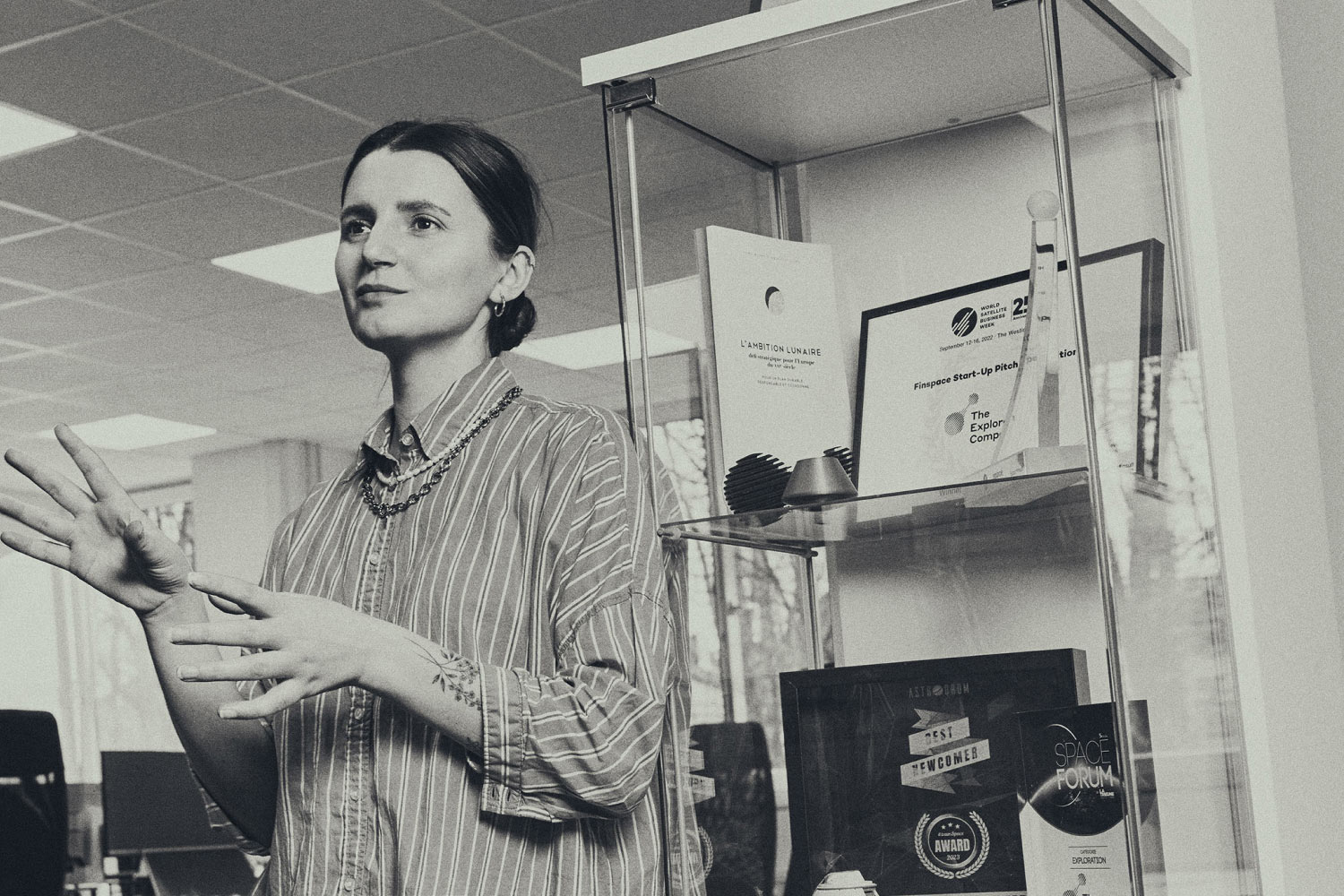
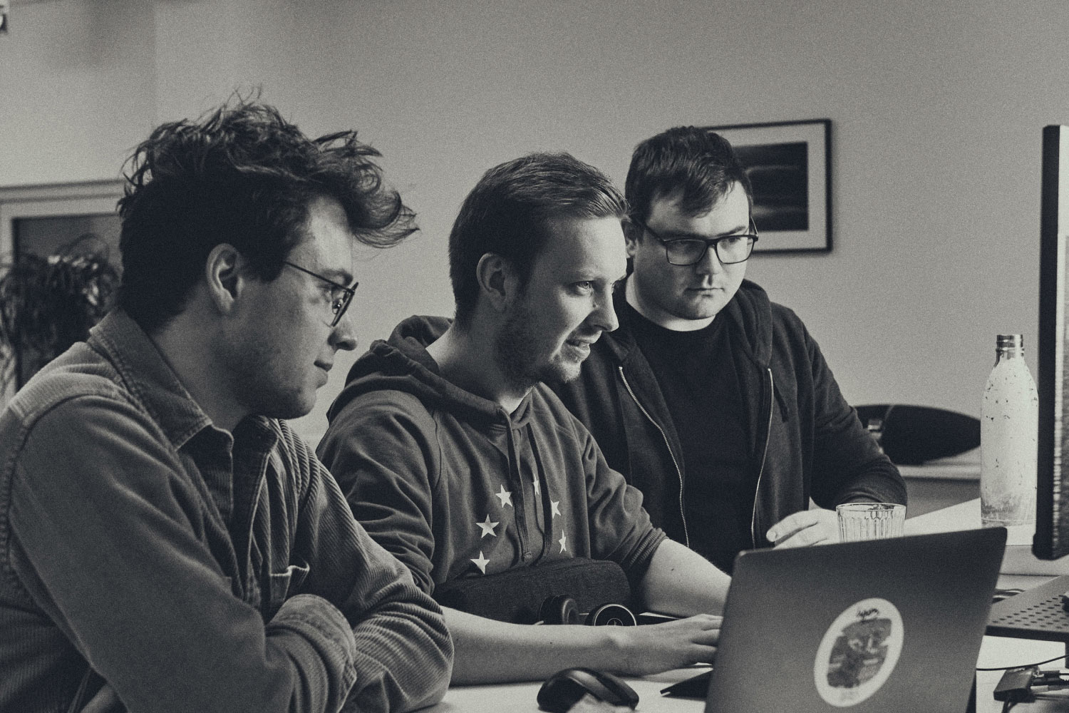
For the company’s portraiture, we took inspiration from the iconic black-and-white photography of NASA teams in the 1960s, as well as portraits of Steve Jobs and the early Apple team, and Charles and Ray Eames at work. These images brought a timeless, human-centered quality to the people behind The Exploration Company. By showcasing the team in this way, we reinforced the idea that space exploration is a collective human endeavor, not just a feat of technological achievement.

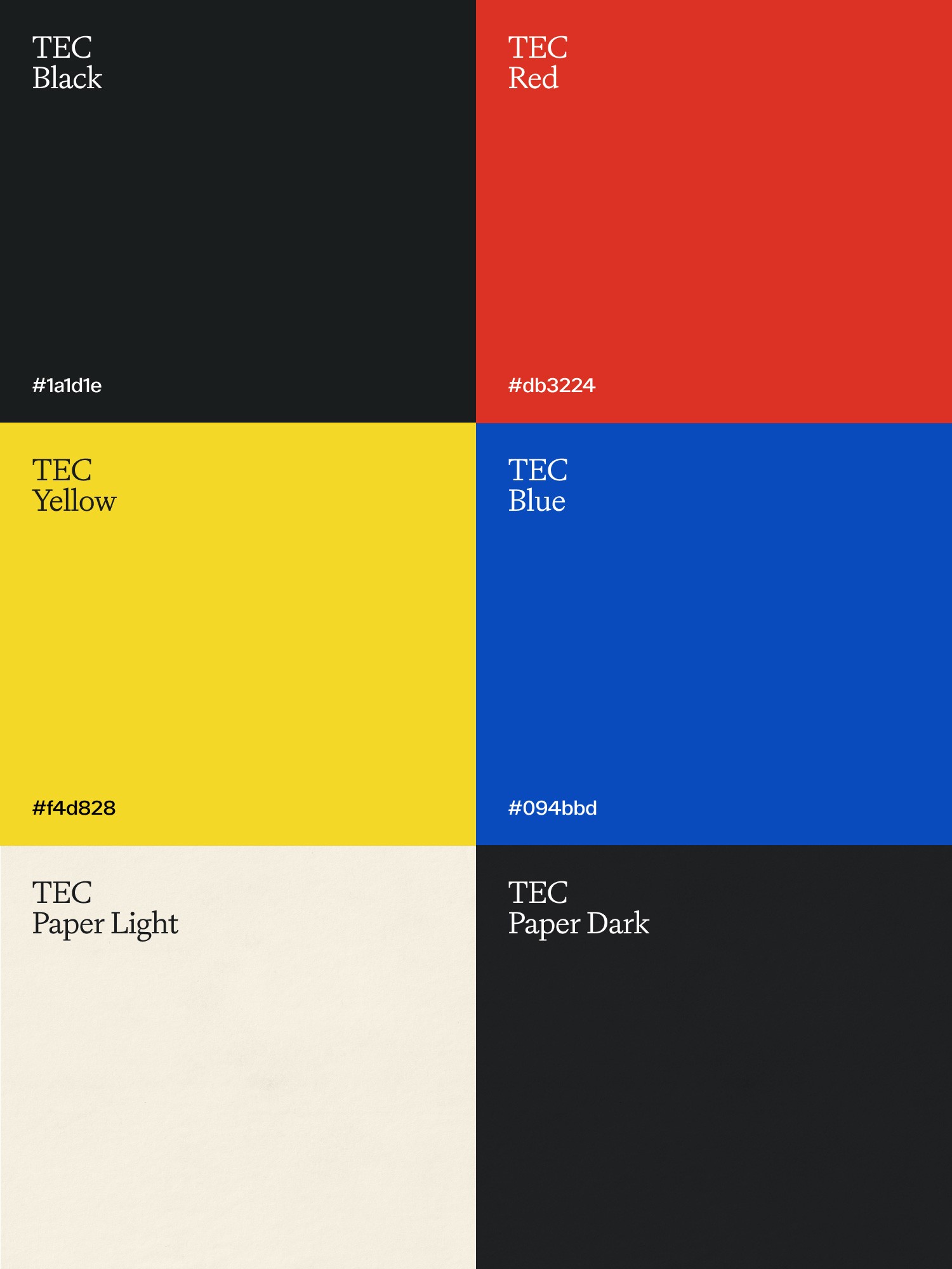
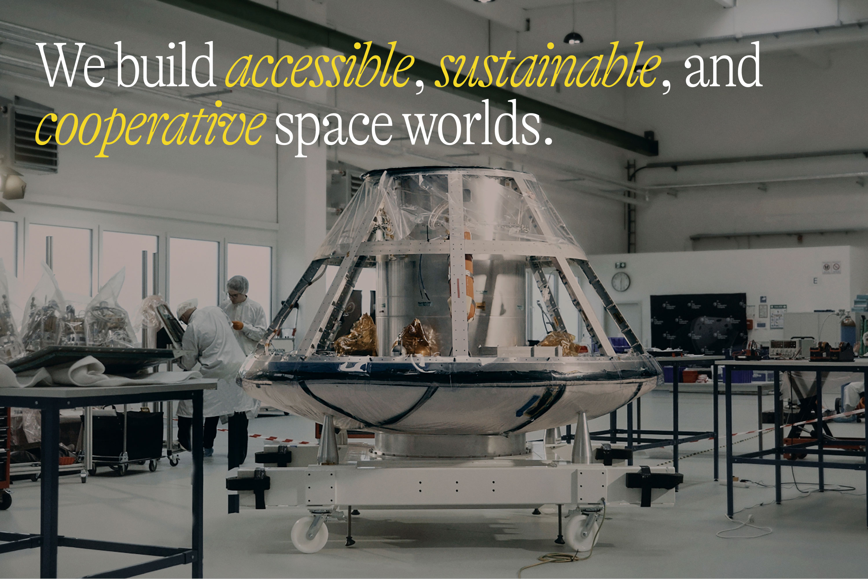
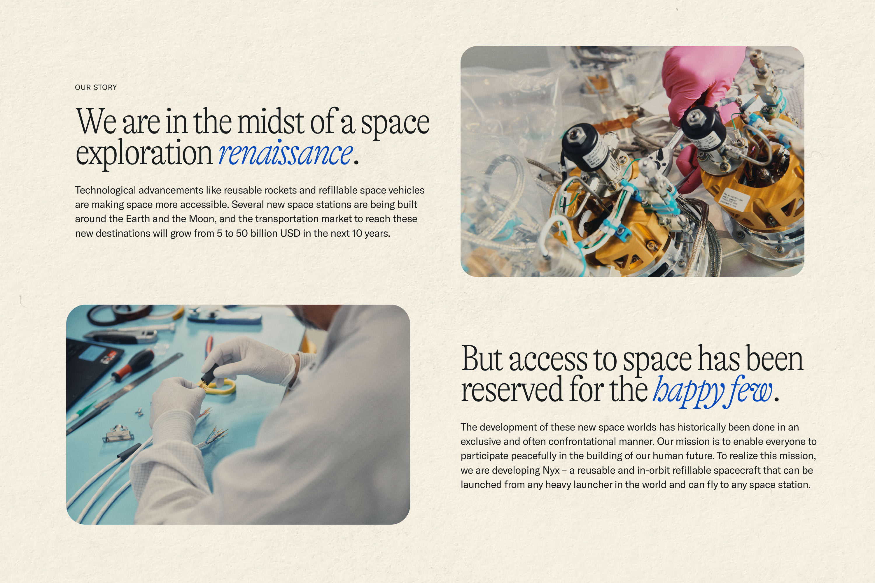
We also created abstract and cinematic visuals to highlight their spacecraft and hardware, giving the technology a tactile, almost sculptural feel. This approach helped turn otherwise complex, mechanical objects into things of beauty, with light and texture transforming them into objects of wonder—like artifacts from the future that invite curiosity and awe. The color palette we developed was directly inspired by the bold but slightly faded primary colors found in the works of Miró and in Paul Rand’s early IBM designs. We balanced reds, blues, and yellows with softer, warm beige tones and paper textures, creating a palette that felt both vibrant and grounded.

For typography, we paired a thin, condensed serif font for headlines with a typewriter-style subhead and a clean, modern sans serif body font—a nod to early Apple advertisements and the design language of the 1970s and 80s. This typography choice helped merge a sense of nostalgia with the forward-looking nature of The Exploration Company’s work.

Our brand refresh for The Exploration Company sought to capture the essence of their mission: to make space exploration accessible, cooperative, and human. We encapsulated this mission in the tagline Space for Everyone. By blending inspiration from art, design, and history with the cutting-edge world of space tech, we created an identity that would feel timeless yet innovative, helping The Exploration Company stand out in a crowded industry while positioning them as the pioneers of a new, more inclusive future in space exploration.

Credits

Client:
The Exploration Company

Creative Direction:
Carl VersfeldMonica Kelly

Strategy:
Carl Versfeld, Monica Kelly, Evan Slater

Design:
Carl VersfeldMonica Kelly

Copy:
Evan Slater, Monica Kelly

Photography:
Nicolas Kern

3D Design:
William Norberg

Video Editing:
Will Milvid, Carl Versfeld

Project Management:
Monica Kelly

Font Foundry:
Grilli Type